Brand
A mark that states its own uncertainty.
Most software in this category draws a helix, a shield or a pill — a claim to be in healthcare. Ours draws the thing we actually produce: an estimate, and how sure of it the evidence lets us be.
The posterior
The idea
A broad prior, and what the evidence leaves of it
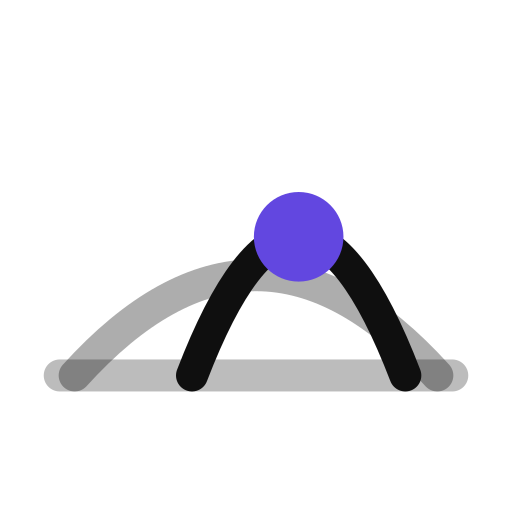
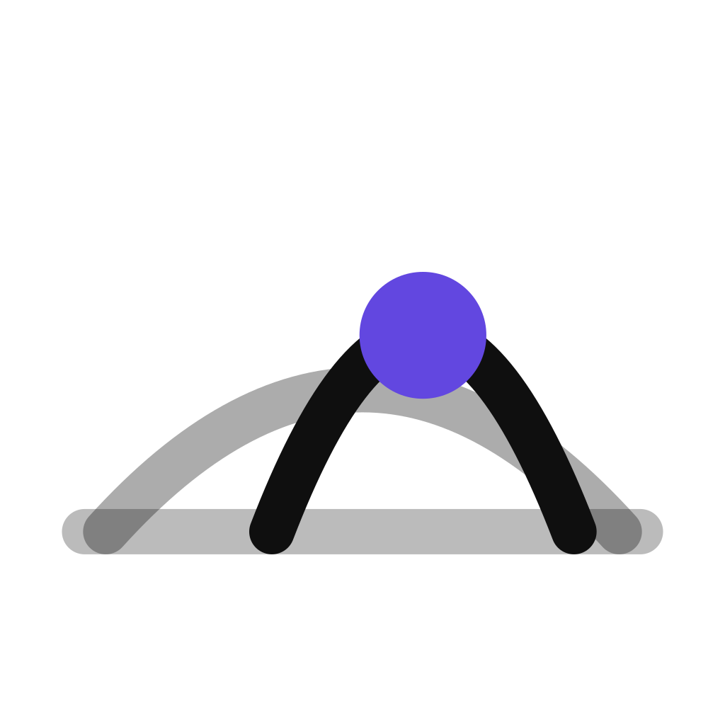
The faint arch is the prior — what is believed about a class of trials before this one is examined. The darker arch is the posterior: narrower, because evidence removed possibilities, and shifted right of the prior's centre, because evidence moved the estimate. The dot on its peak is the estimate itself. It is the shape our cohort model draws when a class-level rate meets a trial's own data.
The axis and the prior are drawn in the surrounding ink colour, so the mark inherits whatever it sits on and inverts with the theme without being told. Only the estimate carries colour, and it is the single accent this site reserves for one moment per page.
Lockups
Three arrangements, and no fourth
Use the horizontal lockup wherever there is a line to sit on. The stacked form is for covers and share cards. The mark stands alone only where the name is already present — an app icon, a favicon, an avatar.
Placement
Clear space, and how small it survives
Keep clear space equal to the height of the posterior on all four sides. The full drawing holds to about 32px. Below that the prior and the axis stop resolving, so a reduced form takes over: it drops both, tightens the arch, and enlarges the estimate so the accent still reads. The favicon is that reduced form on an ink tile.
Files
Download the mark
SVG for anything that scales, PNG at 512 and 1024 for slides and app stores. Every file below is the same geometry the product renders — nothing here is redrawn by hand.



Please don't
Four ways to get it wrong
We would rather be drawn plainly than drawn badly.
Abbreviate the name to “CTO”
In a buyer’s inbox that reads as Chief Technology Officer. Spell it out, or use the mark alone.
Recolour the posterior
It carries the one accent. Recolouring it to match a slide removes the only thing the mark says.
Put the mark in a coloured tile
The app icon is the only tiled form, and its tile is ink. Everywhere else the mark sits directly on the ground.
Stretch, rotate or outline it
The proportions are the distribution. A stretched bell is a different claim.
Press or partner enquiries, and anything not covered here: [email protected].
See a verdict you can actually check.
Send us a protocol — or just a molecule and an indication. We'll return a fully cited feasibility assessment you can trace, line by line, back to public data — yours to defend in a bid, take to your board or investment committee, or hand to a regulator.